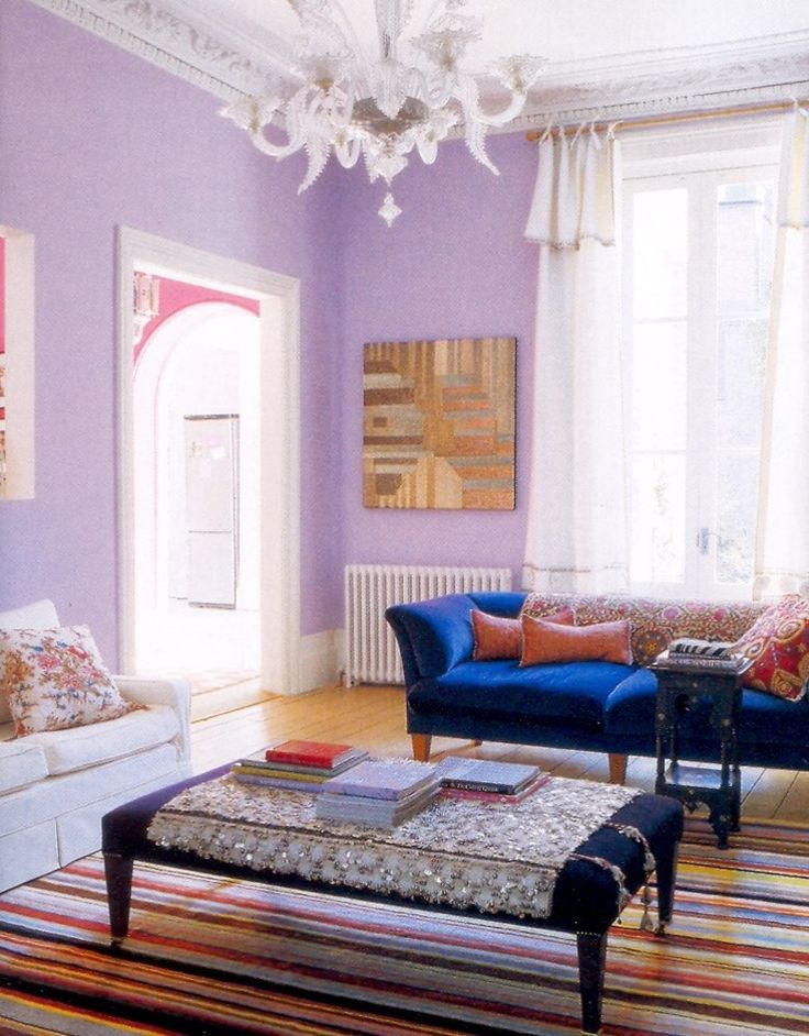
Interblind Shutters

Art 5 trendy colors for this 2024.IDEAL to decorate your home.

Light blue

Light blue conveys calm and freshness almost like no other, which makes it perfect for creating a relaxed atmosphere. Because of its soft and soothing tone, light blue evokes feelings of tranquility and serenity. In what spaces of the house does it work best? Probably in bedrooms, a small study, a reading area, or guest rooms.

Taupe and the range of light sand and earth tones.

Taupe is a trendy and key color for a simple and cozy decor, a classic of Nordic and minimalist decorations. They are neutral shades: grays, beiges, browns .... They all fall within the taupe color, and with them we can create relaxed and very nice decorations. Also called taupe, it corresponds to the neutral shades. It is a color that has been sweeping for some time in the decoration of any room in the house, to create cozy and relaxed environments, which do not tire or irritate us, and that provide great luminosity. The taupe color is the opposite of what we had seen in decoration 15 years ago. No flashy and cold colors (no reds, pinks, or blues...), now what is fashionable is the warmth and naturalness of this type of shades. The taupe color also connects us more with nature since the essence of these tones is born into it.

Gray

This is the new wild card in decoration. Its elegance, versatility and timelessness are reasons for it’s popularity. Therefore, knowing what colors combine with gray is basic to find the formula for success. Other neutrals, intense colors and even materials with warm textures will help you to give it all the prominence it deserves. The color gray in the world of interior design, will stay for a long time, because it’s addition to provides balance and sophistication.

Honey

Halfway between beige and yellow, we have the honey color in its brightest version. A trendy tone capable of gently raising the temperature of a room, providing a sense of comfort, and combining with other different colors, adapting to each decorative style. Perhaps that is why this tone has had and still has a prominent place in interior decoration. Being a color between yellow and brown, honey combines very well with wooden furniture. This union in kitchens is a success since much of the furniture is usually made of wood. In addition, if the combination is added with white, the space is illuminated by itself. Of course, the walls, floor and countertop must also maintain the necessary balance to make the whole a success.

Lilac and lavender

Light shades of lilac or violet, are ideal for creating a shabby chic or vintage style. Darker shades, on the other hand, relate to contemporary and elegant style. The lilac color can look heavy if abused, so it is recommended to use the dark tones in small objects and accessories such as chairs, armchairs, or ornaments. On the other hand, light tones can be used on walls, wallpapers, and furniture, especially in bedrooms. Also, it is common to use lilac tones to decorate bathrooms, thanks to their calming effect.
Scroll al inicio